Chapter 1.1 (Geography F 3)

Compound or cumulative bar graphs

Specific objectives to be achieved

By the end of the topic, the learner should be able to:

  1. analyse and interpret statistical data.
  2. present statistical data using appropriate methods.
  3. discuss the advantages and disadvantages of each method of data presentation.
Introduction

Earlier in this course, we looked at different methods of collecting, recording, analysing and presenting statistical data. Analysing and interpreting data involves reading, deducing valuable facts from the graph drawn and then being able to make meaningful conclusions.

In this topic, we shall discuss statistical presentation, analysis and interpretation of:

  1. compound/cumulative bar graphs
  2. proportional circles
  3. divided pie charts/circles

Compound or cumulative bar graphs

A compound bar graph comprises bars which are drawn horizontally or vertically with each bar sub-divided into segments.

Compound bar graph can be used to present data on quantities of mineral production, agricultural produce such as livestock and crops.

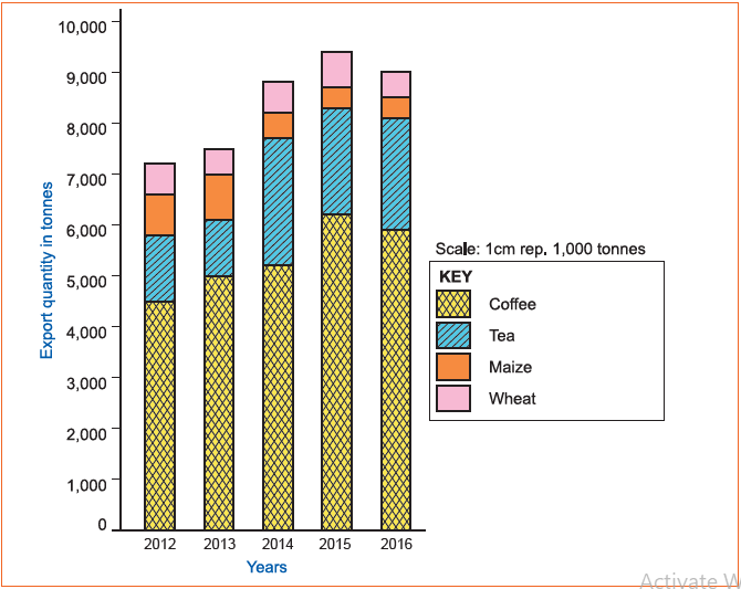
The table below shows estimated figures of exported crops from Country X in tonnes between 2012 and 2016. This information can guide us on how to draw a compound bar graph.

Year

2012

2013

2014

2015

2016

Coffee

4,500

5,000

5,200

6,000

5,900

Cumulative
Total​

4,500

5,000

5,200

6,000

5,900

Tea

1,300

1,100

2,500

2,100

2,200

Cumulative
​Total​

5,800

6,100

7,700

8,100

8,100

Maize

800

900

500

400

400

Cumulative
​Total​

6,600

7,000

8,200

8,500

8,500

Wheat

600

500

600

700

500

Cumulative
​Total​

7,200

7,500

8,800

9,200

9,000

Table 1.1: Crops exported from Country X in tonnes.

Steps followed in construction

  1. The vertical scale represents dependant variables (Quantities produced in tonnes). Use grand total to get vertical scale, putting into consideration the highest and lowest values. For example, from table (1.1) the highest value is 9200 and the lowest value is 7200. Therefore, a suitable scale is 1 cm represents 1000 tonnes.
  2. The horizontal scale represents independent variables (years). For example, 1 cm represents 1 year (2012 to 2016). The bars are drawn with uniform space between them.
  3. Draw the y and x-axes using the estimates obtained from vertical and horizontal scale respectively.
  4. Draw bars for each year using cumulative totals.
  5. Sub-divide the first bar into segments using individual values of exported crops. The segments are drawn in descending order with the largest at the base.
  6. Colour or shade all segments representing same crop in all bars using same colour or pattern for easy interpretation.
  7. Draw a key showing different colours or patterns representing exported crops at the bottom of the graph.
  8. Label y and x-axes. Y-axis represents exported crops in tonnes and x-axis represents years.
  9. Write a title above the graph which highlights the type of graph and what it represents. In our case, the title is: COMPOUND BAR GRAPH SHOWING MAJOR CROPS EXPORTED FROM COUNTRY X IN TONNES BETWEEN 2012 AND 2016.
Fig. 1.1: Compound/Cumulative bar graph showing major cash crops exported from Country X in tonnes

Analysis and interpretation

The main features to check are:

  1. General trend of bars over the period given.
  2. The year with the highest total value.
  3. The year with the lowest total value.
  4. General trend of each item throughout the period.
  5. State whether the increase or decrease is minimal, high or gradual.

Example:
The following are possible analyses onecould deduce from the graph drawn in fig 1.1.

  1. Coffee is the leading crop exported from Country X from the year 2012 to 2016.
  2. The second leading export crop is tea, followed by maize then wheat.
  3. The amount of tonnes exported each year varies from year to year.
  4. 2015 had the leading total tonnes of exported crops.
  5. 2012 had the lowest total tonnes of exported crops.
  6. Coffee export values were on the increase from the year 2012 to 2015.
  7. Maize and wheat contributed least in export values.

Advantages of compound bar graphs

  1. It is easy to estimate total values of segments at a glance.
  2. There is easy comparison for the same segments in different bars.
  3. There is little chance of confusion during interpretation because the segments are shaded differently, thus showing clear contribution of each.
  4. It has a clear visual impression of values.
  5. Different variables can be represented on one bar.

Disadvantages of compound bar graphs

  1. It is difficult to follow and interpret the general trend of any particular segment through the period.
  2. Individual actual contribution made by segments of the same bar is difficult to trace at a glance.
  3. Limited number of commodities can be shown because there is limited space upwards.
  4. Wrong choice of vertical scale causes exaggeration of the length of bars, leading to false impression.
  5. Takes time to draw, since the procedure involves a lot of calculations.
Please wait